( Erbranding Studio )
Role: Brand Identity
Year: 2024
Client/Team: Cittaora Winery
Location: Istria, Croatia

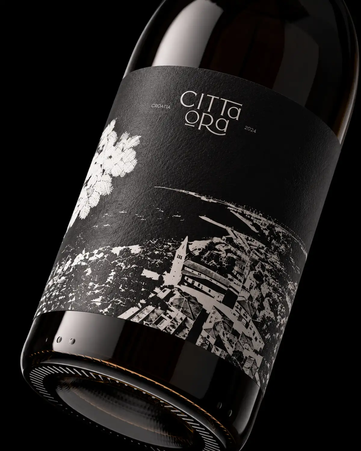
Cittaora takes its name from Cittanova, the Italian name of Novigrad, the coastal town in Istria the winery calls home. We kept the spirit of the original and gave it a twist: where “nova” means new, “ora” means now. The custom logotype carries the story further. Its stacked letterforms echo the silhouette of a wine glass, while the rounded “O” can be read as the base of the glass or a single grape. The mark lives everywhere the wine does, from debossed natural corks to barrel stamps.
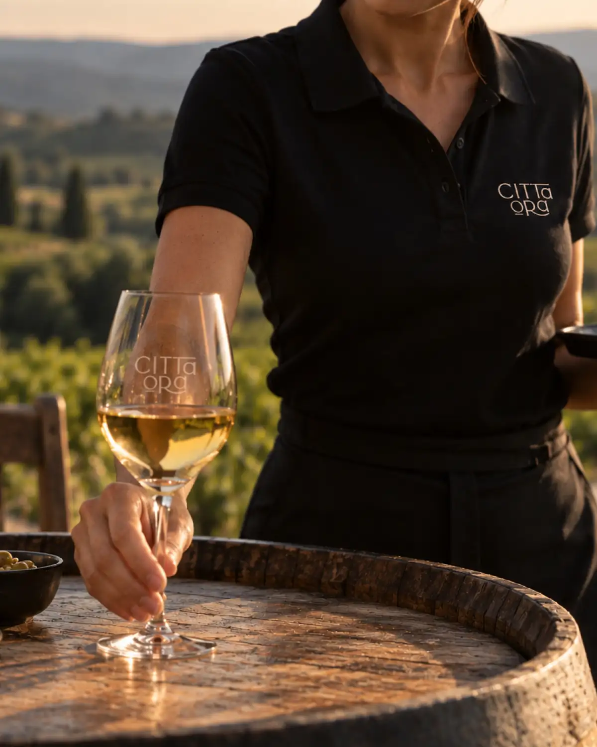
From vineyard to glass, one consistent story.
The label is the centerpiece of the system. It features a detailed black-and-white panorama of Novigrad, its old town walls and bell tower rising from the coast, with the vineyards of the Istrian hinterland stretching out behind it. The illustration sits against deep matte black and is finished with subtle white foil, so the town that gave the wine its name is part of every bottle. Around it we developed the art direction, packaging and branded workwear, giving the team a visual language that feels warm, grounded and unmistakably local.